Advanced Tutorial - Widget
Introduction
This chapter introduces how to add a custom-defined widget to the FineReport designer.
JavaScriptFileHandler & CssFileHandler
Before talking about the widget providers, let's look at these two: JavaScriptFileHandler and CssFileHandler. In Beginner Tutorial - Include your JS&CSS, we know that the JS and CSS files are injected into the platform through WebResourceProvider, but we haven't known how to inject them into the report display. This is what JavaScriptFileHandler and CssFileHandler for.
JavaScriptFileHandler
This is to import the JS file when displaying a report.
package com.fr.stable.fun;

public interface JavaScriptFileHandler extends WebFileHandler {

    String XML_TAG = "JavaScriptFileHandler";

    int CURRENT_LEVEL = 1;
}
The interface itself does not add new methods. The method needed to implement is defined in WebFileHandler. It returns an array of paths to custom JS files to support importing multiple JS files.
package com.fr.plugin.report;

import com.fr.stable.fun.impl.AbstractJavaScriptFileHandler;

public class ReportJavaScriptFileHandler extends AbstractJavaScriptFileHandler {
    @Override
    public String[] pathsForFiles() {
        return new String[]{"/com/fr/plugin/web/js/report/style.text.js"};
    }
}
To register the implementation:
<!-- register in the core module -->
<extra-core>
   <JavaScriptFileHandler class="com.fr.plugin.xxx.youclassname"/>
</extra-core>
<!-- register in the form module -->
<extra-form>
   <JavaScriptFileHandler class="com.fr.plugin.xxx.youclassname"/>
</extra-form>
<!-- register in the report module -->
<extra-report>
   <JavaScriptFileHandler class="com.fr.plugin.xxx.youclassname"/>
</extra-report>
CssFileHandler
CssFileHandler is much like JavaScriptFileHandler, except that it applies to CSS files.
package com.fr.stable.fun;

public interface CssFileHandler extends WebFileHandler {

    String XML_TAG = "CssFileHandler";

    int CURRENT_LEVEL = 1;
}
package com.fr.plugin.report;

import com.fr.stable.fun.impl.AbstractCssFileHandler;

public class ReportCssFileHandler extends AbstractCssFileHandler {
    @Override
    public String[] pathsForFiles() {
        return new String[]{"/com/fr/plugin/web/js/report/style.text.css"};
    }
}
To register the implementation:
<!-- register in the core module -->
<extra-core>
   <CssFileHandler class="com.fr.plugin.xxx.youclassname"/>
</extra-core>
<!-- register in the form module -->
<extra-form>
   <CssFileHandler class="com.fr.plugin.xxx.youclassname"/>
</extra-form>
<!-- register in the report module -->
<extra-report>
   <CssFileHandler class="com.fr.plugin.xxx.youclassname"/>
</extra-report>
Add a Widget to Parameter Panel
Use ParameterWidgetOptionProvider to add a new widget to the parameter panel.
public interface ParameterWidgetOptionProvider extends Mutable {

    String XML_TAG = "ParameterWidgetOptionProvider";

    int CURRENT_LEVEL = 1;

    /**
     * the class of the custom widget, which should extend com.fr.form.ui.Widget
     * @return widget class
     */
    Class<? extends Widget> classForWidget();

    /**
     * the UI class of the custom widget, which should extend com.fr.form.designer.creator.XWidgetCreator
     * @return UI class
     */
    Class<?> appearanceForWidget();

    /**
     * the path to the icon of the widget shown in the designer
     * @return the path to the icon
     */
    String iconPathForWidget();

    /**
     * the name of the custom widget
     * @return widget name
     */
    String nameForWidget();
}
There are two classes that need to be extended: Widget and XWidgetCreator. Let's take a look at how this should be done.
Widget
This is the parent class for a widget. Ususally we should also implement DataControl in our own widget.
public class TestWidget extends Widget implements DataControl {
    /**
     * The type of the widget. Use lower case only.
     * @return
     */
    @Override
    public String getXType() {
        return "testwidget";
    }

    /**
     * Whether to display the widget directly when it is a cell widget.
     * @return
     */
    @Override
    public boolean isEditor() {
        return false;
    }

    /**
     * Events supported. There are EVENT_CLICK, AFTERINIT, BEFOREEDIT, AFTEREDIT, CHANGE, STOPEDIT and EVENT_STATECHANGE.
     * @return
     */
    @Override
    public String[] supportedEvents() {
        return new String[0];
    }

    /**
     * In DataControl, it returns type supported by the widget return value.
     * @return
     */
    @Override
    public int[] getValueType() {
        return new int[0];
    }

    /**
     * In DataControl, it is to set widget value.
     * @param widgetValue
     */

    @Override
    public void setWidgetValue(WidgetValue widgetValue) {

    }

    /**
     * In DataControl, it is to get widget value.
     * @return
     */
    @Override
    public WidgetValue getWidgetValue() {
        return null;
    }

    /**
     * In DataControl, it is used to render the widget result.
     * @param dataControl
     * @param calculator
     * @param widgetResult
     * @param attrSourceCache
     */
    @Override
    public void createValueResult(DataControl dataControl, Calculator calculator, JSONObject widgetResult, JSONObject attrSourceCache) {

    }

    /**
     * In DataControl, to get the format of the widget.
     * @return
     */
    @Override
    public String getFormatText() {
        return null;
    }

    /**
     * In DataControl, provide a default value when the widget value is bound with a field.
     * @param calculator
     * @return
     */
    @Override
    public String getDataBindDefaultValue(Calculator calculator) {
        return null;
    }

    /**
     * In DataControl, it shows the dependence between the current object and parameters.
     * @param calculatorProvider
     * @return
     */
    @Override
    public String[] dependence(CalculatorProvider calculatorProvider) {
        return new String[0];
    }
}
Below is an example used to illustrate how to create a widget. It is based on the existing TextEditor, adding font color to the attributes. The DataControl interface is implemented in TextEditor.
public class DemoWidget extends TextEditor {
    /**
     * Add a property fontColor.
     * Need to create getter and setter.
     */
    private Color fontColor = Color.BLACK;

    /**
     * widget type
     * @return
     */
    @Override
    public String getXType() {
        return "styletext";
    }

    /**
     * To return the attribute JSON. It is passed to the front end as "widget.options"
     * Here add a new property fontColor.
     * @param repository
     * @param calculator
     * @param nodeVisitor
     * @return
     * @throws JSONException
     */
    @Override
    @ExecuteFunctionRecord
    public JSONObject createJSONConfig(Repository repository, Calculator calculator, NodeVisitor nodeVisitor) throws JSONException {
        return super.createJSONConfig(repository, calculator, nodeVisitor).put("fontColor", StableUtils.javaColorToCSSColor(this.fontColor));
    }

    public DemoWidget() {
        super();
    }

    /**
     * Read settings from the template (XML).
     */
    @Override
    public void readXML(XMLableReader xmLableReader) {
        super.readXML(xmLableReader);
        if (xmLableReader.isChildNode()) {
            String tagName = xmLableReader.getTagName();
            if (ComparatorUtils.equals(tagName, "FontColor")) {
                this.setFontColor(rgbTOColor(xmLableReader.getElementValue()));
            }
        }
    }

    /**
     * Save the settings in the template (XML).
     */

    @Override
    public void writeXML(XMLPrintWriter xmlPrintWriter) {
        super.writeXML(xmlPrintWriter);
        xmlPrintWriter.startTAG("FontColor").textNode(StableUtils.javaColorToCSSColor(this.fontColor)).end();
    }

    public Color getFontColor() {
        return fontColor;
    }

    public void setFontColor(Color fontColor) {
        this.fontColor = fontColor;
    }

    private Color rgbTOColor(String rgbStr) {
        int start = rgbStr.indexOf("(");
        int end = rgbStr.indexOf(")");
        if (start < 0 || end < 0 || start > end) {
            return Color.RED;
        }
        String colorString = rgbStr.substring(start + 1, end);
        String[] array = colorString.split(",");
        return new Color(Integer.parseInt(array[0]), Integer.parseInt(array[1]), Integer.parseInt(array[2]));
    }

    @Override
    public boolean isEditor() {
        return false;
    }
}
XWidgetCreator
This is the UI for the property setting of a widget in the parameter panel and form. First we will introduce what methods should be implemented in order to use this class.
public class TestEditor extends XWidgetCreator {
    public TestEditor(Widget widget, Dimension dimension) {
        super(widget, dimension);
    }

    /**
     * To return a component, which is the appearance of the widget shown on the parameter panel.
     * @return
     */
    @Override
    protected JComponent initEditor() {
        return null;
    }

    /**
     * Return the parent component of current XCreator. In most cases, XWScaleLayout is used.
     *
     * @param widgetName the name of the current widget
     * @return
     */
    @Override
    protected XLayoutContainer getCreatorWrapper(String widgetName) {
        return super.getCreatorWrapper(widgetName);
    }

    /**
     * Add the current component to its parent
     * @param xLayoutContainer the return value of getCreatorWrapper()
     * @param width
     * @param minHeight
      */
    @Override
    protected void addToWrapper(XLayoutContainer xLayoutContainer, int width, int minHeight) {
        super.addToWrapper(xLayoutContainer, width, minHeight);
    }

    /**
     * To paint on the component returned by initEditor(). For instance, we want to show current text on the text editor.
     * @param g
     */
    @Override
    public void paintComponent(Graphics g) {
        super.paintComponent(g);
    }

    /**
     * Property supported by the widget
     * @return
     * @throws IntrospectionException
     */
    @Override
    public CRPropertyDescriptor[] supportedDescriptor() throws IntrospectionException {
        return super.supportedDescriptor();
    }
}
In our example, the UI class inherits from the XTextEditor, which is the UI for the TextEditor.
public class XStyleTextEditor extends XTextEditor {
    public XStyleTextEditor(TextEditor textEditor, Dimension dimension) {
        super(textEditor, dimension);
    }

    /**
     * Since the widget add a new property fontColor, we need to rewrite the property pane.
     *
     * @return
     * @throws IntrospectionException
     */
    @Override
    public CRPropertyDescriptor[] supportedDescriptor() throws IntrospectionException {
        CRPropertyDescriptor[] sup = super.supportedDescriptor();
        /**
         * "fontColor" is the new property name.
         * this.data.getClass() is the widget class.
         * getFontColor and setFontColor are the getter and setter for the property. That's why we should define them in DemoWidget.
         * setI18NName returns the label name. We are supposed to use Locale Finder in real development.
         * setEditorClass is to set the editing pane of the property. StyleColorAttrEditor is what we implemented to edit color.
         * putKeyValue("category", "Fine-Design_Report_Advanced") is to set the parent pane for the current property.
         */
        CRPropertyDescriptor styleAttr = new CRPropertyDescriptor("fontColor", this.data.getClass(),"getFontColor","setFontColor").setI18NName("Font Color")
                .setEditorClass(StyleColorAttrEditor.class).putKeyValue("category", "Fine-Design_Report_Advanced");
        return ArrayUtils.addAll(sup,new CRPropertyDescriptor[]{styleAttr});
    }
}
There is an editor class called StyleColorAttrEditor referred to above. As long as the property is not of a basic type, the correspoding editor class needs to be created by ourselves.
public class StyleColorAttrEditor extends AbstractPropertyEditor {
    /**
     * A button to set font color.
     */
    private UIColorButton colorButton = new UIColorButton();

    public StyleColorAttrEditor() {
        super();
        /**
         * Add a change listener to the color select button.
         * The color change will modify the propertyChangeEvent of the property pane.
         */
        colorButton.addColorChangeListener(new ChangeListener(){
            @Override
            public void stateChanged(ChangeEvent e) {
                firePropertyChanged();
            }
        });
    }

    /**
     * Set value for the current property.
     * @param value
     */
    @Override
    public void setValue(Object value) {
        if (value instanceof Color){
            this.colorButton.setColor((Color) value);
            this.colorButton.repaint();
        }
    }

    /**
     * This method will be called to return property value when firePropertyChanged() is invoked.
     * @return
     */
    @Override
    public Object getValue() {
        return this.colorButton.getColor();
    }

    /**
     * The actual component shown on the property pane.
     * @return
     */
    @Override
    public Component getCustomEditor() {
        return colorButton;
    }

    /**
     * Value validation method.
     * @throws ValidationException
     */
    @Override
    public void validateValue() throws ValidationException {

    }
}
Now we have accomplished the definition of the widget and its UI. Then we should register them in ParameterWidgetOptionProvider.
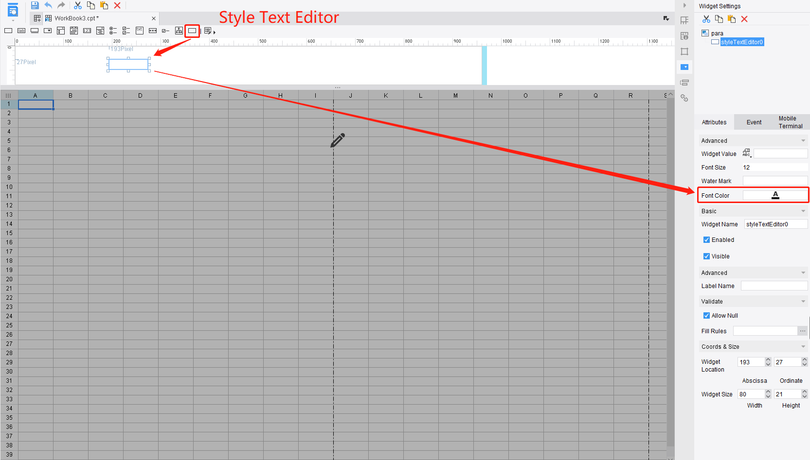
public class DemoParaFormWidgetProvider extends AbstractParameterWidgetOptionProvider implements FormWidgetOptionProvider {
    /**
     * Method required in FormWidgetOptionProvider.
     * @return true if the widget is a container
     */
    @Override
    public boolean isContainer() {
        return false;
    }

    @Override
    public <T> void paste2Container(T t) {

    }

    @Override
    public Class<? extends Widget> classForWidget() {
        return DemoWidget.class;
    }

    @Override
    public Class<?> appearanceForWidget() {
        return XStyleTextEditor.class;
    }

    @Override
    public String iconPathForWidget() {
        return "/com/fr/plugin/widget/demo/images/text_field_16.png";
    }

    @Override
    public String nameForWidget() {
        return "Style Text Editor";
    }
}
The class above can be applied to parameter panel and form. In fact, the implementation is available for both of them.
Register the Widget on the Front End
All the widgets on the front end are extended from FR.Widget. Let's define a new component for our example widget.
;!(function () {
    /**
     * Extend FR.TextEditor.
     */
    FR.StyleTextEditor=FR.extend(FR.TextEditor,{
        /**
         * the initialization method
         * @private
         */
        _init: function () {
            FR.StyleTextEditor.superclass._init.apply(this, arguments);
        },
        /**
         * Get options passed from the back end.
         * Apply the font color to the element.
         * @returns {*|jQuery|HTMLElement}
         * @private
         */
        _createEditComp: function() {

            var o=this.options;

            return $("<input style='color:"+o.fontColor+"' type='text'/>");
        }
    });
    /**
     * Use shortcut to register the widget. The name should be unique and the same as the return value of Widget#getXType.
     */
    $.shortcut("styletext", FR.StyleTextEditor);
})();
Don't forget to use JavaScriptFileHandler mentioned at the beginning to include this JS file.
Finally, we can register the implementation in the plugin.xml.
<extra-designer>
    <ParameterWidgetOptionProvider class="com.fr.plugin.widget.demo.para.DemoParaFormWidgetProvider"/>
</extra-designer>
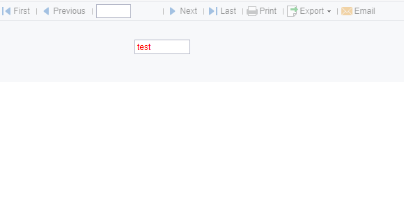
The effect of the example is like below:
Add a Widget to Form
The interface FormWidgetOptionProvider inherits from ParameterWidgetOptionProvider. So it is much the same as ParameterWidgetOptionProvider except for its way of registering.
<extra-designer>
    <FormWidgetOptionProvider class="com.fr.plugin.widget.demo.para.DemoParaFormWidgetProvider"/>
</extra-designer>
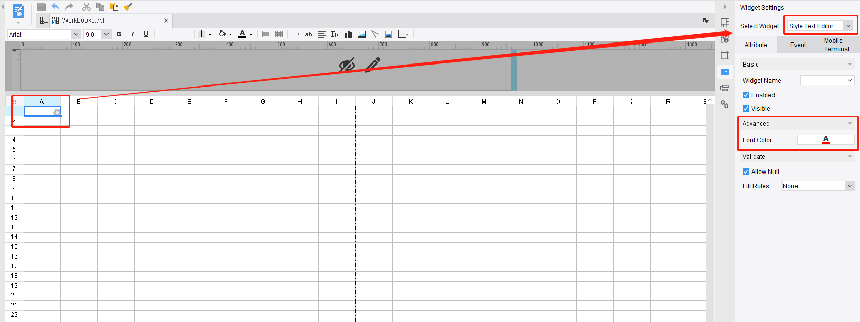
Add a Widget to Cell
First, let's see what the provider looks like.
public interface CellWidgetOptionProvider extends ParameterWidgetOptionProvider {

    String XML_TAG = "CellWidgetOptionProvider";

    /**
     * The appearance of the cell widget
     * @return
     */
    Class<? extends BasicBeanPane<? extends Widget>> appearanceForWidget();

}
As you can see, it also inherits from the ParameterWidgetOptionProvider. The only difference is that the UI setting method appearanceForWidget has to return subclass of BasicBeanPane.
I am not gonna talk too much about BasicBeanPane here. Just use the example below, and you will get the rough idea of how to add the style text editor as a cell widget.
public class ColorSelectPane extends JPanel {
    private UIColorButton colorButton = new UIColorButton();

    /**
     * Create a color select pane. The label and UIColorButton arrange horizontally.
     */
    public ColorSelectPane() {
        this.setLayout(new BorderLayout());

        double f = TableLayout.FILL;
        double p = TableLayout.PREFERRED;
        Component[][] components = new Component[][]{
                new Component[]{new UILabel("Font Color"), colorButton},
        };
        double[] rowSize = {p};
        double[] columnSize = {p, f};
        int[][] rowCount = {{1, 1}};
        JPanel panel = TableLayoutHelper.createGapTableLayoutPane(components, rowSize, columnSize, rowCount, IntervalConstants.INTERVAL_W3, IntervalConstants.INTERVAL_L1);
        this.add(panel, BorderLayout.CENTER);
    }

    public Color getColor(){
        return this.colorButton.getColor();
    }

    public void setColor(Color color){
        this.colorButton.setColor(color);
        this.colorButton.repaint();
    }
}
public class StyleCellTextDefinePane extends TextFieldEditorDefinePane {
    private ColorSelectPane colorSelectPane;

    /**
     * Add a custom-defined color select pane.
     * @return
     */
    @Override
    protected JPanel setFirstContentPane() {
        JPanel supPane = super.setFirstContentPane();
        colorSelectPane = new ColorSelectPane();
        supPane.add(colorSelectPane, BorderLayout.CENTER);
        return supPane;
    }

    /**
     * Set value for the color select pane.
     * @param textEditor
     */
    @Override
    protected void populateSubFieldEditorBean(TextEditor textEditor) {
        super.populateSubFieldEditorBean(textEditor);
        if(textEditor instanceof DemoWidget){
            this.colorSelectPane.setColor(((DemoWidget) textEditor).getFontColor());
        }
    }

    /**
     * Put the value from the color select pane to the widget object.
     * @return
     */
    @Override
    protected TextEditor updateSubFieldEditorBean() {
        TextEditor supEditor = super.updateSubFieldEditorBean();
        if (supEditor instanceof DemoWidget){
            ((DemoWidget) supEditor).setFontColor(this.colorSelectPane.getColor());
        }
        return supEditor;
    }

    /**
     * @return a custom widget object.
     */
    @Override
    protected TextEditor newTextEditorInstance() {
        return new DemoWidget();
    }
}
public class DemoCellWidgetOptionProvider extends AbstractCellWidgetOptionProvider {
    @Override
    public Class<? extends Widget> classForWidget() {
        return DemoWidget.class;
    }

    @Override
    public Class<? extends BasicBeanPane<? extends Widget>> appearanceForWidget() {
        return StyleCellTextDefinePane.class;
    }

    @Override
    public String iconPathForWidget() {
        return "/com/fr/plugin/widget/demo/images/text_field_16.png";
    }

    @Override
    public String nameForWidget() {
        return "Style Text Editor";
    }
}
Register the implementation in the plugin.xml.
<extra-designer>
    <CellWidgetOptionProvider class="com.fr.plugin.widget.demo.para.DemoParaFormWidgetProvider"/>
</extra-designer>
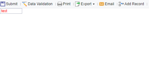
The effect of the example is shown below:
The full code of this example is placed here: https://github.com/finereport-overseas/report-starter-10/tree/master/plugin-widget-demo